You can add animation to your forms in two different ways: either by choosing from the predefined options or by adding the animation effects to chosen background images sourced from their media library.
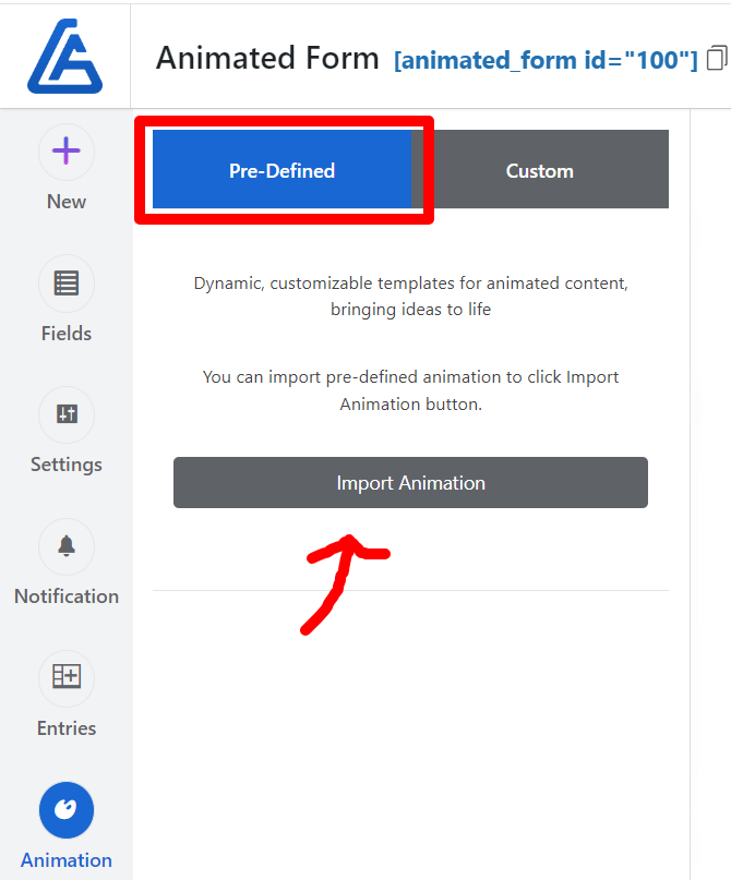
First, let’s look at how to directly import predefined animations into the forms. In the animation section navigate to ‘Pre-defined’ tab and click ‘Import Animation’. Just scroll down and select the right animation that suits your form’s purposeand click ‘Import’.
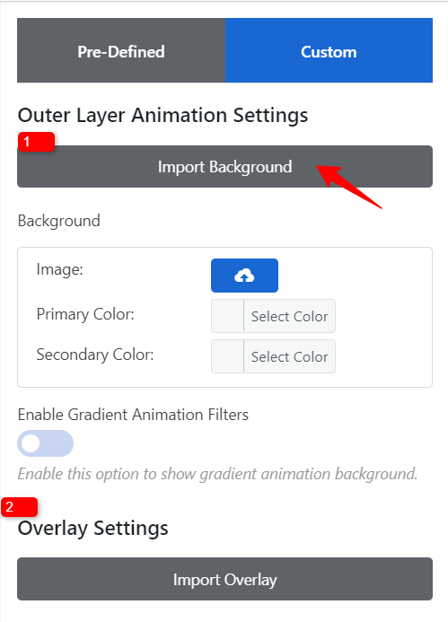
Now, let’s move on to the second part: how to use the desired source image and apply animation to it. You can choose the background in two ways: either from the predefined library or by selecting an image from your media library.
Custom Background:
- Navigate to the ‘Outer Layer Animation Settings’ section, click ‘Import Background,’ and select a predefined background from the library.
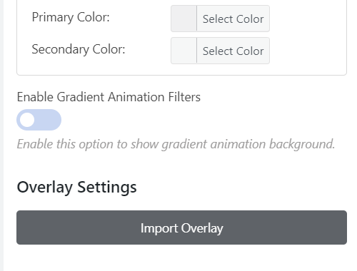
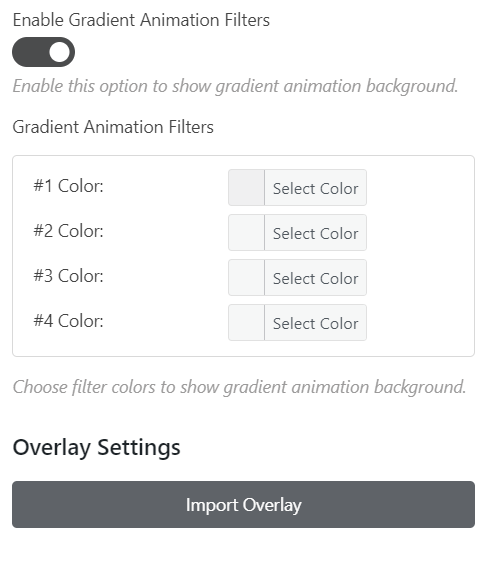
- Click ‘Overlay Settings’ and choose the overlay that you want to impose over the background image.
- Click ‘Save’ and preview the animation for the forms to check everything looks correct before publishing it.
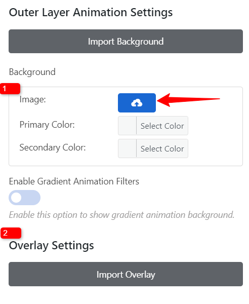
Media Library Image:
- Upload an image from your media library by clicking the upload icon. A screen displaying your media library images will appear. Select your desired image from there.
- Click ‘Overlay Settings’ and choose the overlay that you want to impose over the background image.
- Click ‘Save’ and preview the animation for the forms to ensure everything looks correct before publishing it.
How to add Gradient Animation?
Adding a gradient effect creates dynamic visual effects that enable smooth transitions between colors, enhancing the visual appeal and user engagement of your forms. Moving on to the steps for creating gradients, ‘Enable Gradient Animation Filters’
Setting a Two-Color Background with an animation effect
- Set the background with two different colors. Click the ‘Select Color’ button and choose the primary color to set it at the top and the secondary color to appear at the bottom. This will make the form appear with the primary color at the top, a mixed texture in the middle, and the secondary color at the bottom, creating a visually appealing effect.
- To add Animations, Click ‘Overlay Settings’ and choose the overlay that you want to impose over the background color.
Setting Gradient Color with an Animation Effect
- Enable Gradient Animation Filters to bring a gradient background to the form, making it dynamic, appealing, and vibrant with mixed colors. By default, it will apply a preset set of colors, but you can customize it with your favorite colors by clicking the ‘Select Colors’ button in the ‘Gradient Animation Filters’ section.
- To add Animations to the gradient, Click ‘Overlay Settings’ and choose the overlay that you want to impose over the background color.
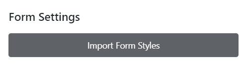
Form Settings
Click the ‘Import Form Styles’ button to select a predefined layout, offering a range of ready-made layout styles.
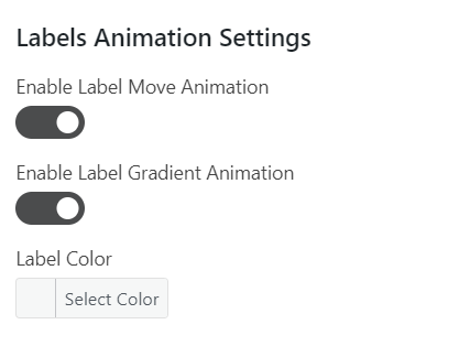
Labels Animation Settings
- Enable Label Move Animation – Enable the option to make animation effects for the label.
- Enable Label Gradient Animation – Enable the option to add a gradient effect to the label and choose the desired color by clicking the ‘desired color’
- Label Color – Use this option to change the color of the label text to the desired shade.
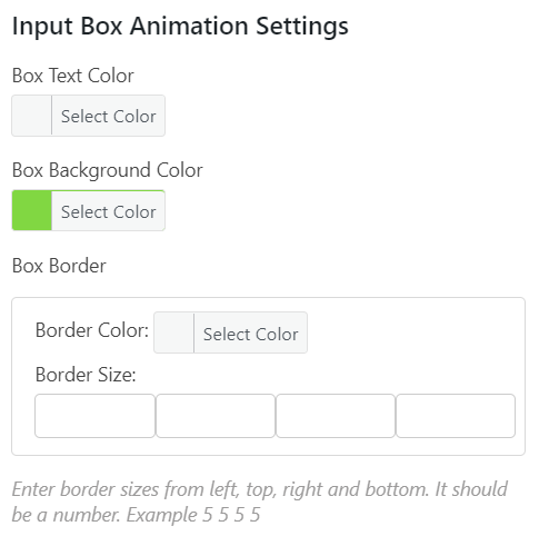
Input Box Animation Settings
- Box Text Color – Using the option you can change the color of the input text to the desired shade.
- Box Background Color – Enabling the option you can change the background color of the input box, to match your desired theme.
- Label Color – Use this option to change the color of the label text to the desired shade.Box Border – This section allows you to set the Color and Size surrounding an input box. It lets you customize the border thickness and color to align with your design preferences.
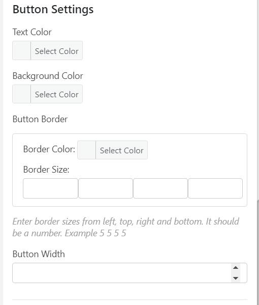
Button Settings
- Text Color – Using the option you can change the color of the button text to the desired shade.
- Background Color – Enabling the option you can change the background color of the button, to match your desired theme.
- Border Color – Helps to customize the color of the border surrounding the button element on a web page.
- Border Size – Customize the thickness of the border around a button element. It defines how wide the button border appears. You can specify left, top, right, and bottom values to define how wide the button border appears on each side.
- Button Width – Using the option, you can customize the button’s width on the user interface.